→ Pdf specimen of the typeface Almandin
Buy Almandin fonts at ILT — from $32
→ Pdf specimen of the typeface Almandin
The road to the creation of Almandin has been a long one: design on this typeface began 9 years ago. We decided to work on this project without any deadlines,
according to our desires, our availability and our thoughts, sometimes even with a break of several years to come back to it.
Of course, the project has evolved over these 9 years, sometimes in unexpected directions: the current typeface has very little in common with the first sketches.
Like the very first typeface from our foundry, this one is a four-handed design, which has helped to develop the typeface in a less linear way.
The result is a slightly calligraphic sans, influenced by our years studying at the École Estienne, where calligraphy was central. We had to rise to the challenge
of creating a sans that was both neutral enough to be used in many contexts, and at the same time highly recognisable. Robert Slimbach's work, particularly on Cronos, was
an important reference.
With this project, we've tried to rediscover the pleasure of drawing that we had when we were still students, with no constraints or time limits, while retaining
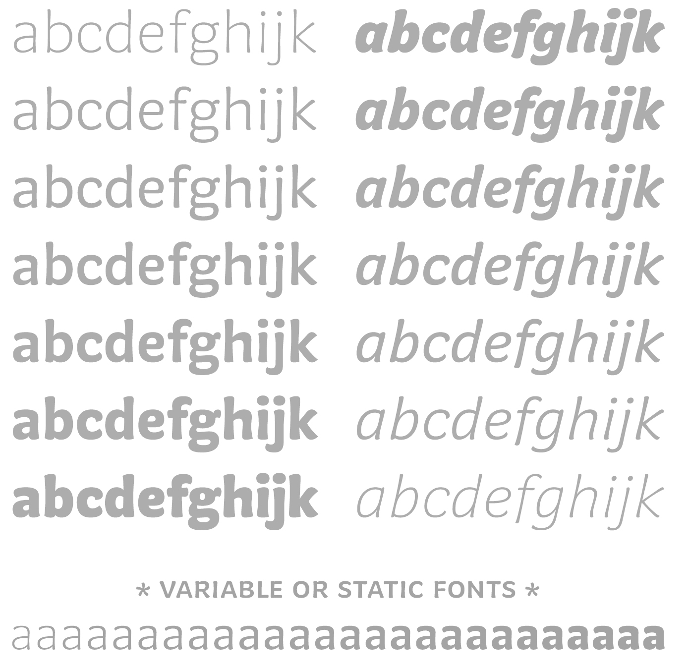
the pleasure of experimentation, and a place for chance. Almandin contains many stylistic variations and is available in a choice of 7 static weights or 1 variable version.
The first versions of the typeface had a relatively small difference in width between the lightest and heaviest weights. We thought it would be a good idea to
eliminate this variation altogether, so as to offer a family whose overall width remains constant whatever the weight chosen. This choice, although technically demanding,
provides real aesthetic and graphic added value.
NEWSLETTER
MASTODON
CONTACT