Pdf specimen of the typeface Copte Scripte
Awards
Laureate of the Type Design Competition Letter.2 of the ATypI
Type Directors Club Certificate of Excellence in Type Design of New York
![]()
![]()
Pdf specimen of the typeface Copte Scripte
Awards
Laureate of the Type Design Competition Letter.2 of the ATypI
Type Directors Club Certificate of Excellence in Type Design of New York
![]()
![]()
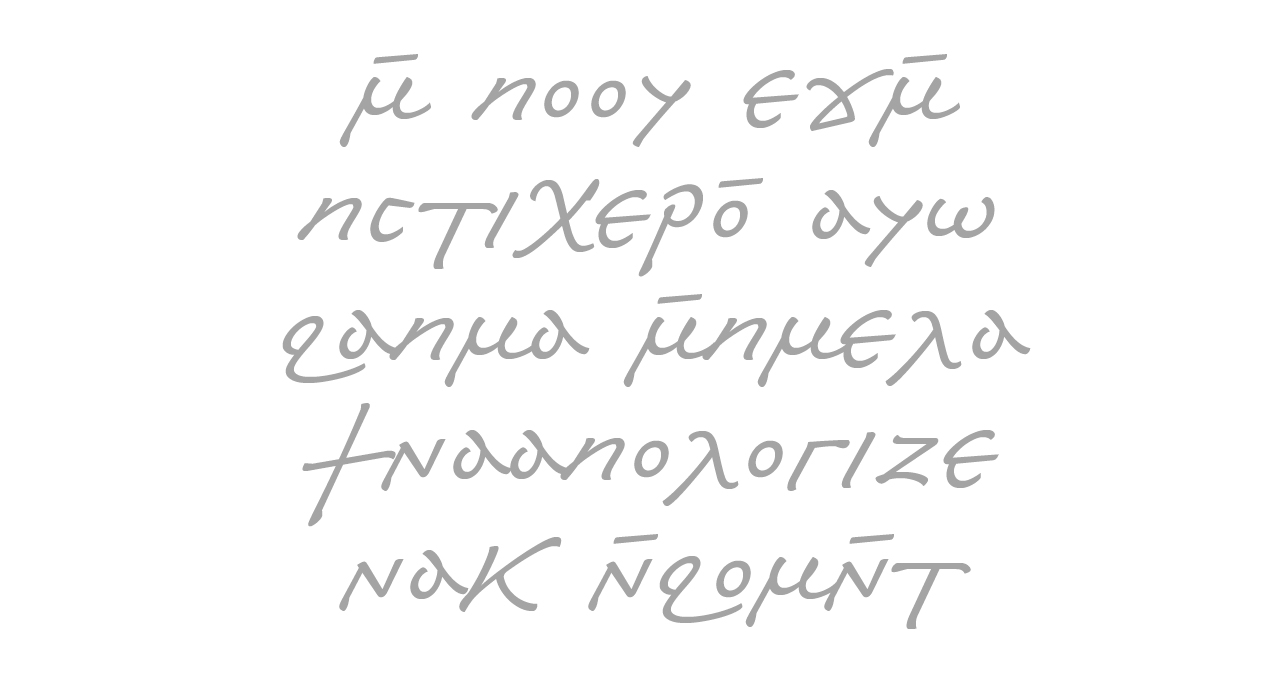
Coptic writing is the conjunction between two scripts and two cultures, Egyptian and Greek.
It borrows 24 characters from Greek writing and the other 7 come from Demotic,
which was the script used in Egypt before. Beyond the change of glyphs, the true revolution
came in structural changes: thanks to the Greek, Egypt discovered the alphabetical
system.
I began to work on this project with Laurent, after six months spent in Cairo. Each
of us had worked on Coptic the years before, Laurent on a resolutely contemporary approach
with Unicopte, while I had worked on a classical historical option with Ifao N Copte.
We thought of this project as a third approach in working on ancient scripts, an option in which
cursive writing and the human being are at the core of the typographic work.
The first typographical issue was to find a balance between cursiveness and stabilization,
between faithfulness and distance to the model. From the beginning, we were at work on a Coptic
papyrus from the seventh century, but the typeface is also the result of studies of numerous
models to be able to find more representative shapes and to understand structures. We have
tried to produce shapes, which, when repeated, would result in giving to a typographical
document an impression close to that of a manuscript.
What was also at stake in this project was to show the cursiveness without using ligatures
all the time. We decided to consider the letters as having a downstroke and an upstroke, but
that this upstroke and this downstroke were not made by the tool itself, but that the contrast
only came from the pressure applied to the tool. The vibration created is more subtle, and only
based on our analysis of the gesture in the ductus of the glyph.
This typeface offers an alternate choice to the uncial image of Coptic writing, intimately linked
with religion and reproducing religious documents, to reproduce documents related to
everyday life. The researchers and the publishers are free to choose the form which would suit
them better according to the documents published and to establish a close relationship between
the social context of the text and its typographical image.
These fonts are Mac and PC compatible, and based on Unicode. It is also compatible with the
Coptic fonts from the IFAO Publishing Office. A virtual keyboard to allow keying in Coptic
texts via our Azerty keyboard has already been created for Mac.
We hope this tool, quite experimental in the field of scientific publishing, will help in
the publishing of numerous cursive documents and will be convincing to publishers and researchers,
and also make them aware of the typographical problems of reproducing ancient documents, while
maybe opening new aesthetic perspectives, which have been hardly explored for Coptic and other
ancient scripts.
Designers: Laurent Bourcellier & Jonathan Fabreguettes
NEWSLETTER
MASTODON
CONTACT